Checked against Apple’s macOS 27 Appearance and Accessibility guides on 2 November 2026. Settings may look slightly different on earlier releases.
If a Finder sidebar blends into your wallpaper or the new macOS look makes controls hard to spot, you do not have to change your whole desktop theme. Start with the one setting that affects transparent backgrounds, then add contrast or larger text only if you still need it.
First, make transparent areas solid
- Open System Settings.
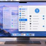
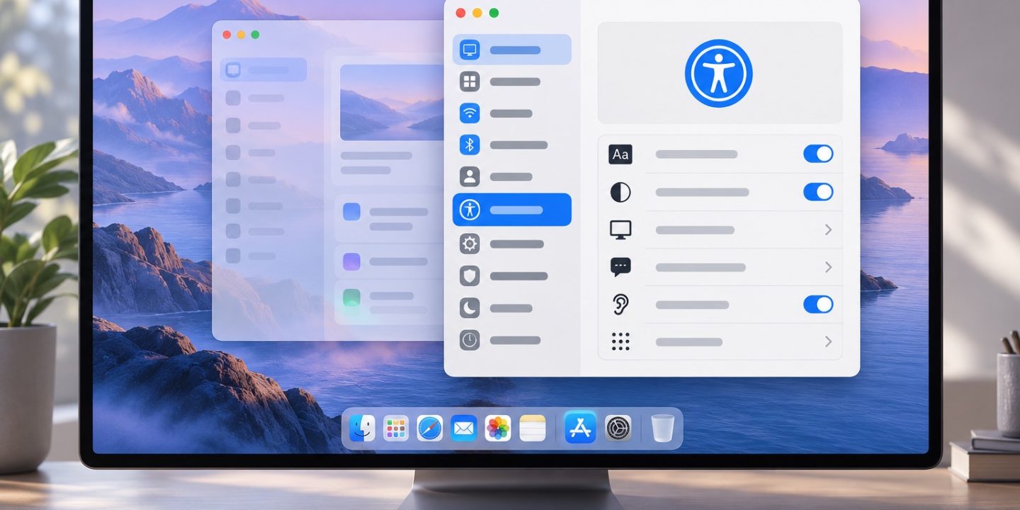
- Choose Accessibility, then Display.
- Turn on Reduce transparency.
This replaces the transparent effect on some macOS backgrounds with solid surfaces. Keep Finder, Mail, or the app that bothered you open while you compare the result. It is easy to turn the option off again if you prefer the original appearance.
If buttons still blend in, increase contrast
On the same Accessibility → Display page, try Increase contrast. Apple describes this as making items such as button and box borders easier to distinguish. It does not simply make your entire screen brighter. Toggle it while looking at a window you use every day and keep it only if navigation becomes clearer.
If toolbar controls are difficult to recognise, Show toolbar button shapes adds subtle boundaries to their clickable areas. That is a more targeted change than altering the whole screen’s contrast.
What the Liquid Glass slider changes
In macOS 27, System Settings → Appearance has a Liquid Glass slider. Apple’s Appearance guide describes it as adjusting how clear or tinted app icons look. It can make icons easier to recognise, but if the problem is a transparent sidebar or menu bar, use Reduce transparency above. You can also choose Light, Dark, or Auto in Appearance if one is more comfortable for your work.
If the issue is text size
Transparency settings will not make small text larger. In Accessibility → Display, look for Text size to adjust supported apps and system features. Try one change at a time so you can tell which setting actually helps. A website or app may also have its own zoom or text-size control.
If you are exploring other changes in this release, see our practical macOS 27 guide. The appearance options here are preferences for comfort and readability, not a speed fix.
Sources: Apple: Display settings for accessibility and Apple: Appearance settings.